Seamlessly blending adventure and organization. Itinero balances the excitement of exploration with the need for efficient organization, providing travelers with a seamless way to plan and manage their trips.
User Research
I conducted semi-structured interviews with five participants to understand the needs of travelers. Using affinity diagramming, I categorized their insights into key themes to guide the design process.
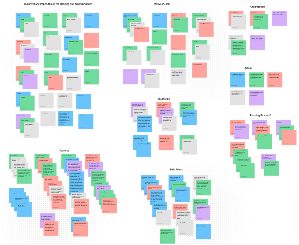
Affinity Diagram in FigJam
Based on user research findings, I prioritized two key features:
- Itinerary Creation and Editing: Allowing users to easily create and modify travel itineraries.
- Personalized Recommendations: Providing tailored suggestions for food, activities, and attractions based on user preferences.
Sketches
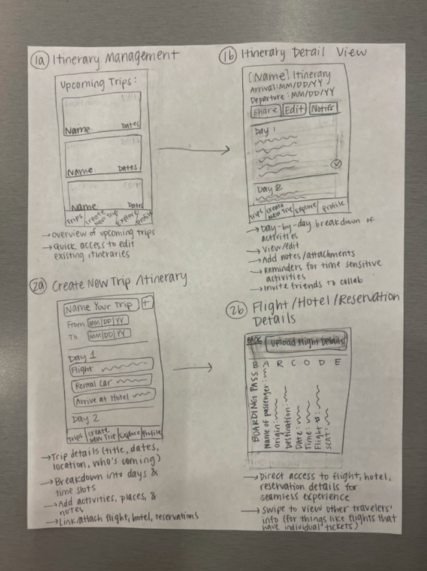
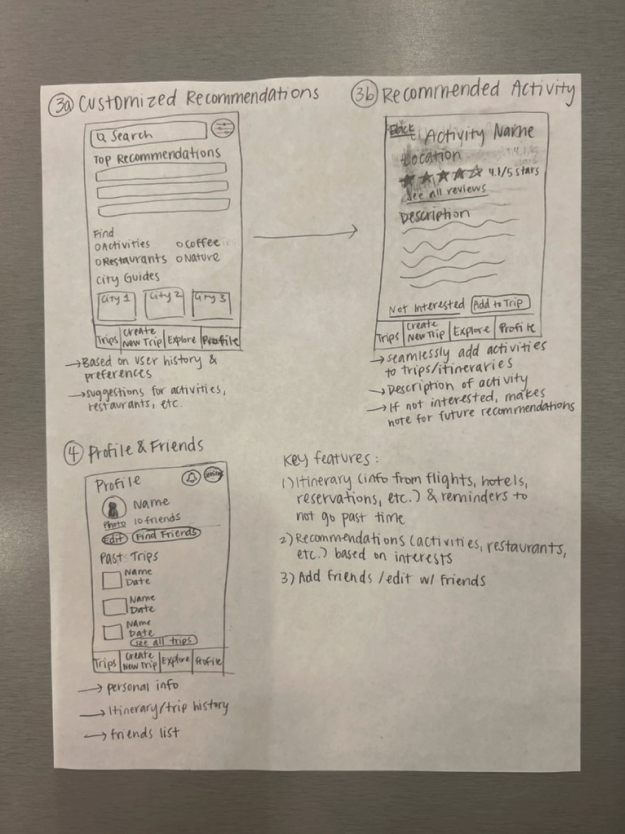
I sketched out the interface with pencil and paper to outline the core features of the app.
Mood Board
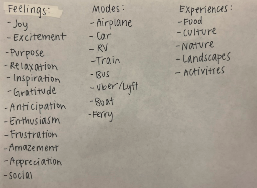
I started by brainstorming words and feelings commonly associated with travel, aiming to incorporate these emotions into my design.
Brainstormed Words on Paper
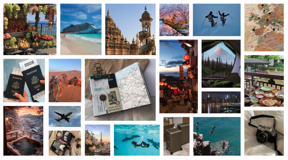
Next, I gathered images to build a mood board, capturing the essence of travel with items like passports, suitcases, travel journals, cameras, maps, airplanes, and destinations worldwide.
Mood Board
My mood board prominently featured calming blue shades, leading me to choose blue for the logo and primary accent color. This color evokes a sense of calm and aligns with emotions associated with exploration—joy, inspiration, and relaxation.
Logo Design
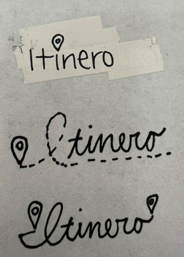
I began by sketching various concepts on paper, incorporating travel elements like location pins, compasses, and planes to capture the essence of the Itinero brand.
Initial Logo Sketches on Paper
Finalized Logo
Low-Fidelity Prototypes
Next, I translated the conceptual sketches into a low-fidelity prototype using Figma, focusing on key screens and core functions.
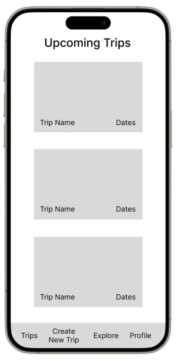
Homepage / Upcoming Trips
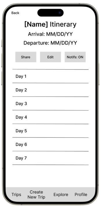
Full Trip Itinerary
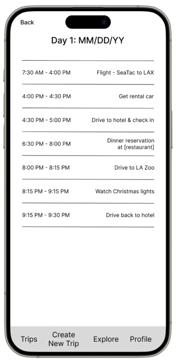
Day 1 Itinerary
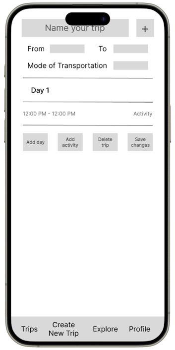
Itinerary Builder Feature
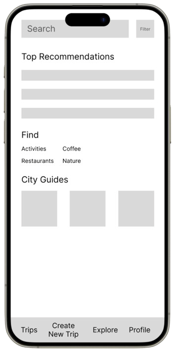
Personalized Recommendations
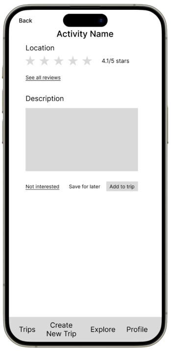
Activity View
High-Fidelity Prototype
After refining the wireframes, I developed high-fidelity prototypes to visualize the final design. These prototypes incorporate the updated branding elements and improved user interface, providing a more engaging and intuitive experience for users.
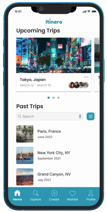
Homepage / Upcoming Trips
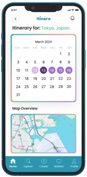
Trip Itinerary
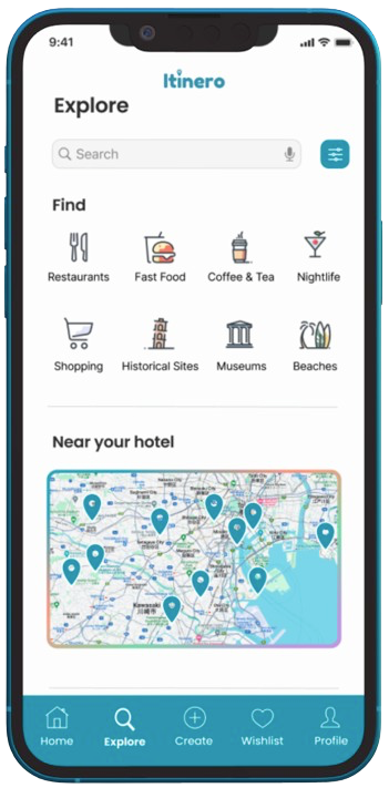
Explore Page with Personalized Recommendations
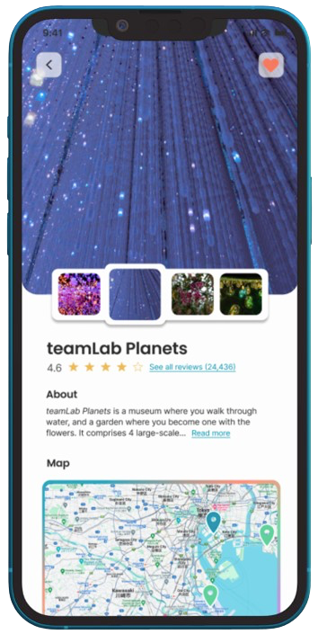
Activity View
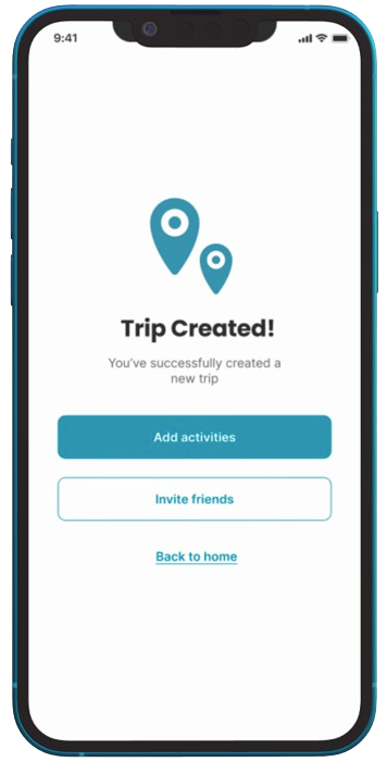
Trip Created
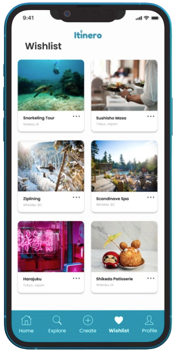
Wishlist
